The no name brand in Canada is known by all. Now this simple but iconic brand has launched its biggest campaign since launching in the 1970’s, and it’s a fresh change to the over the top branding happening in some corners of the world.
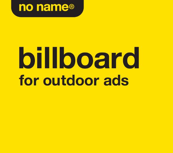
The campaign includes TV spots, outdoor advertising and social media and focuses on getting the message out about its new health label, whilst having a heap of fun.
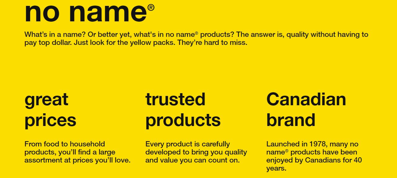
The brand, founded in 1978 by Loblaw, Canada’s largest grocery chain, is known for its signature yellow-and-black-Helvetica packaging. That look continues in the new push from agency John St., which is just as much for No Name as it is for Simple Check, a new health-conscious seal denoting more than bargain-priced 500 No Name products—from peanut butter to potato chips—made without ingredients such as synthetic colors, artificial sweeteners and hydrogenated oils.
“The inspiration for the campaign comes directly from the iconic, yellow and black design, and the clean, no-nonsense language on our packaging,” says Uwe Stueckmann, senior vice president of marketing for Loblaw.


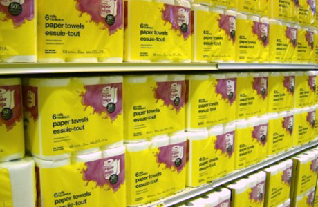
No Name has rarely been known as a big spender when it comes to advertising—probably because just about every Canadian already knows what it is: bright yellow boxes; lower-case black type; the brand that, were it not so ubiquitous, would be easy to overlook. In the company’s words, “Just look for the yellow packs. They’re hard to miss.”
this is a sub-headline
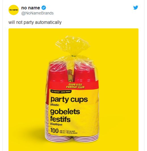
Since launching its first-ever Twitter account earlier this year in the lead-up to the Simple Check campaign, No Name has been amassing tens of thousands of followers with simple, idiosyncratic tweets about its products. “i am a brand,” its bio reads. “follow me.”
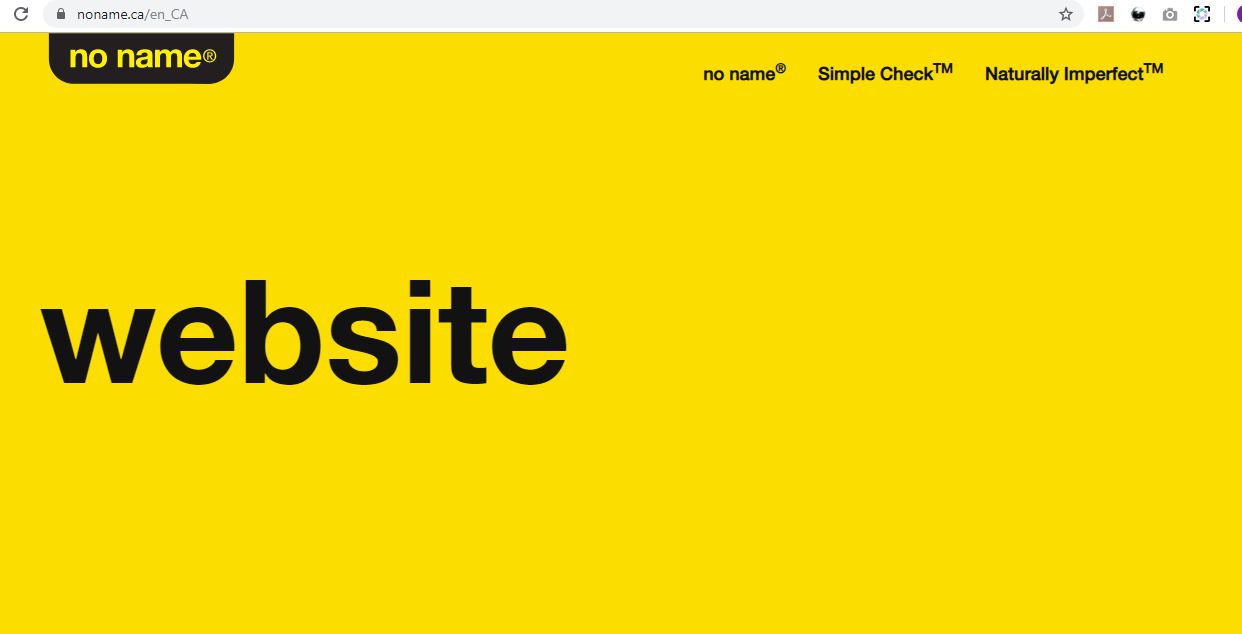
Their website is pretty to the point as well. 🙂