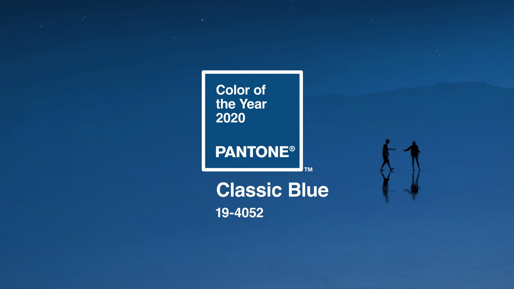
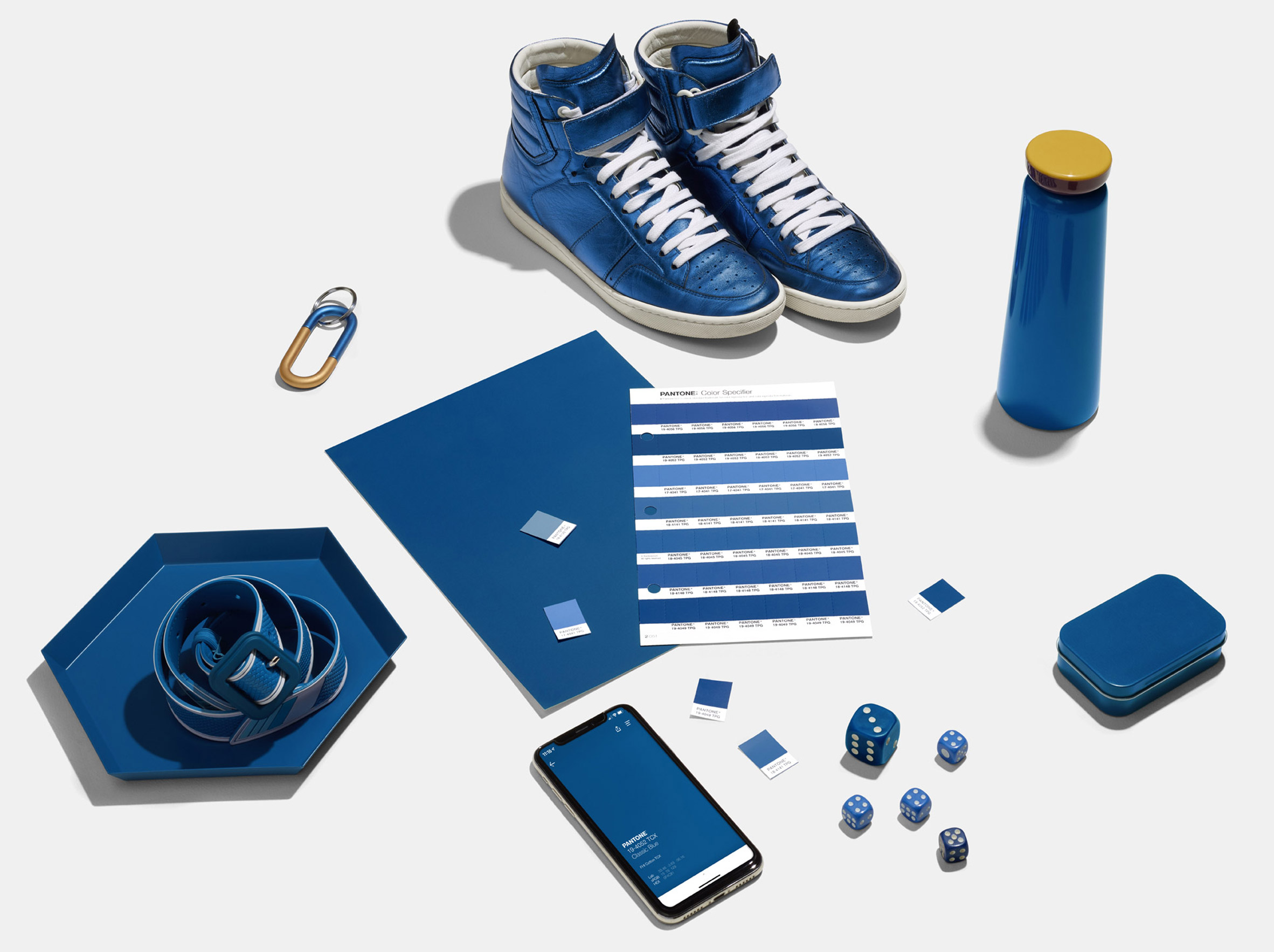
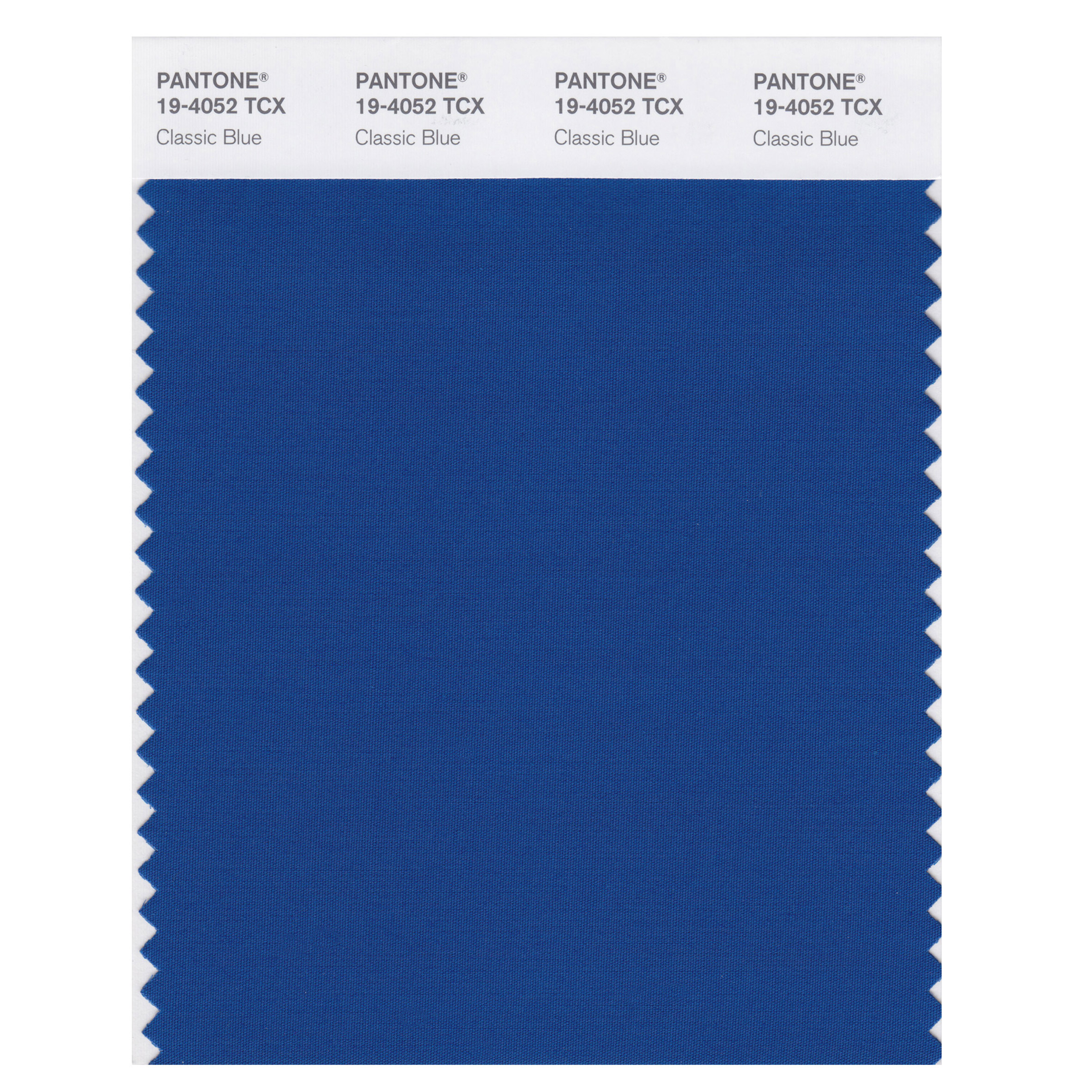
Pantone has revealed its colour of the year 2020 – Classic Blue 19-4052.
The reasons why are:
“the Classic Blue colour is described by Pantone as “a reassuring presence instilling calm, confidence and connection, and it brings a sense of peace and tranquillity to the human spirit, offering refuge,” according to the company.
Announced 4 December, “Associated with the return of another day, this universal favourite is comfortably embraced,” it added.
While this year’s colour Living Coral was an “animating and life-affirming”, 2020’s shade brings a sense of peace and tranquillity to the human spirit, offering refuge,” according to the company.
The cobalt blue hue is also said to be associated with communication, introspection and clarity. Other benefits of the hue include aiding concentration and helping to re-centre thoughts, particularly in light of technology’s accelerating developments.
“We are living in a time that requires trust and faith,” she added. “It is this kind of constancy and confidence that is expressed by Pantone 19-4052 Classic Blue, a solid and dependable blue hue we can always rely on.”
Pantone was founded in the 1950s as the printing company in New York but is now based in Carlstadt, New Jersey. Since 2000, it has chosen a colour of the year decided from trend-forecasting research performed by the Pantone Color Institute.
The annual colour, which is announced each December, is chosen based on “what is taking place in our global culture at a moment in time”.


